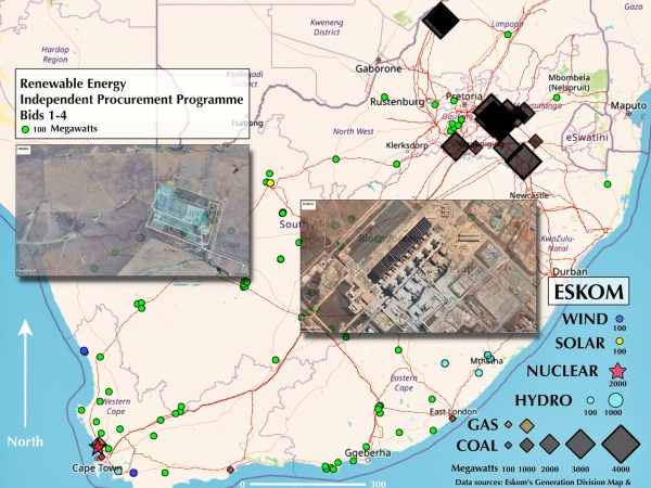
One big problem with the energy crisis is visualisation. I keep reading names and figures but until they have a geographical context I can't really understand the problems. So I've put on my Geography Professor Emeritus hat, sourced appropriate data from Eskom and done some GIS work to establish: Where are the power stations; How much... Continue Reading →
GIS Mapping shows High Court Should Remain in Makana
Every few years the Government does its best to wreck the legal and economic life of Makana by proposing to move the High Court to Bhisho. In the mid 1990s I assisted the fight to keep the court here with some maps and population data that showed Makhanda (what was then Grahamstown) to be the... Continue Reading →
Africa’s Occasional Rivers
Every once in a while I'll return to one of my lifetime's passions - making maps. This post is about one of the biggest mapping problems. If you look either at the header to this post or some of the beautiful maps of South Africa's river networks they give the impression that the region is... Continue Reading →
Escher’s Butterflies Migrating Over The Rivers of Africa
I've really found Escher's work to be inspirational and it's so nice to be able to take it into a new dimension. I re-imagined Escher's Butterflies in one of my earlier posts and now I've finished mapping the whole continent's rivers I've been able to realise a new, more complete, look for the idea. Escher's... Continue Reading →
The Fish and Scales Topographic Map of South Africa
MC Escher produced his famous Fish and Scales print in 1950 - at the same time as The Butterflies. And so, following on from my re-imagination of The Butterflies in yesterday's post, I've used the same method to produce the Fish and Scales Topographic Map of South Africa. You should be able to pick out... Continue Reading →
MC Escher’s Butterflies Print Re-imagined
MC Escher's work has always amazed me with the way he transforms reality: peeling it away in layers to reveal new structures and perceptions. Lately I've begun to wonder if I couldn't use one of his prints - The Butterflies - to blend his work with how Geographers use Geographic Information Systems to portray the... Continue Reading →
Atlas of Kenya: Ethnic Distributions slideshow
Way back in 1990 I went on sabbatical leave to St Mary's College, Durham University, and produced an Atlas of Kenya. I specifically wanted to map where ethnic groups lived at independence (1963) and where they lived in 1979 at the end of President Kenyatta's government. I used the 1962 and 1979 population censuses to... Continue Reading →
SANORD Member Universities 2013: Google Map
I am often asked: just what is this SANORD organisation, who is in it?Well the answer to the first question can be found in the new (and much improved) SANORD website.We currently have over 40 member Universities from the Nordic and SADC (Southern African Development Community) regions and to answer the second question I have... Continue Reading →
Indian or Asian Population map: Grahamstown 2011
This is the last of the four maps based on data in the 2011 Population Census and it plots the dispersal of Grahamstown's small number of Indians or Asians (total 484). The distribution of Grahamstown's Indian or Asian population shows a wide spread through the former white areas. Their group area was located two kilometres almost... Continue Reading →
White Population map: Grahamstown 2011
With 5657 people the white population was the third largest group in Grahamstown recorded in the 2011 Population Census. The map of their distribution shows that the centre of gravity (weighted mean centre) lies approximately one kilometre north west of the Cathedral. Most of the white population live in the northern suburbs and western side... Continue Reading →